Brand refresh, web design and development for Kof-K
H H o o w w t t o o M M o o d d e e r r n n i i z z e e a a n n d d R R e e e e n n e e r r g g i i z z e e a a L L e e g g a a c c y y B B r r a a n n d d
Industry
Food and Beverage
Services
Rebranding
Brand Strategy
Copywriting
Web Design
Web Development
Technology
Angular, Atomic design, Storybook
→ → T T h h e e c c h h a a l l l l e e n n g g e e

KOF-K is one of the world’s largest and best-known kosher certifiers. The Kof-K Kosher Certification has a 50-year legacy, and with more than 300,000 products certified yearly, the brand is recognized, trusted, and sought out by consumers worldwide.
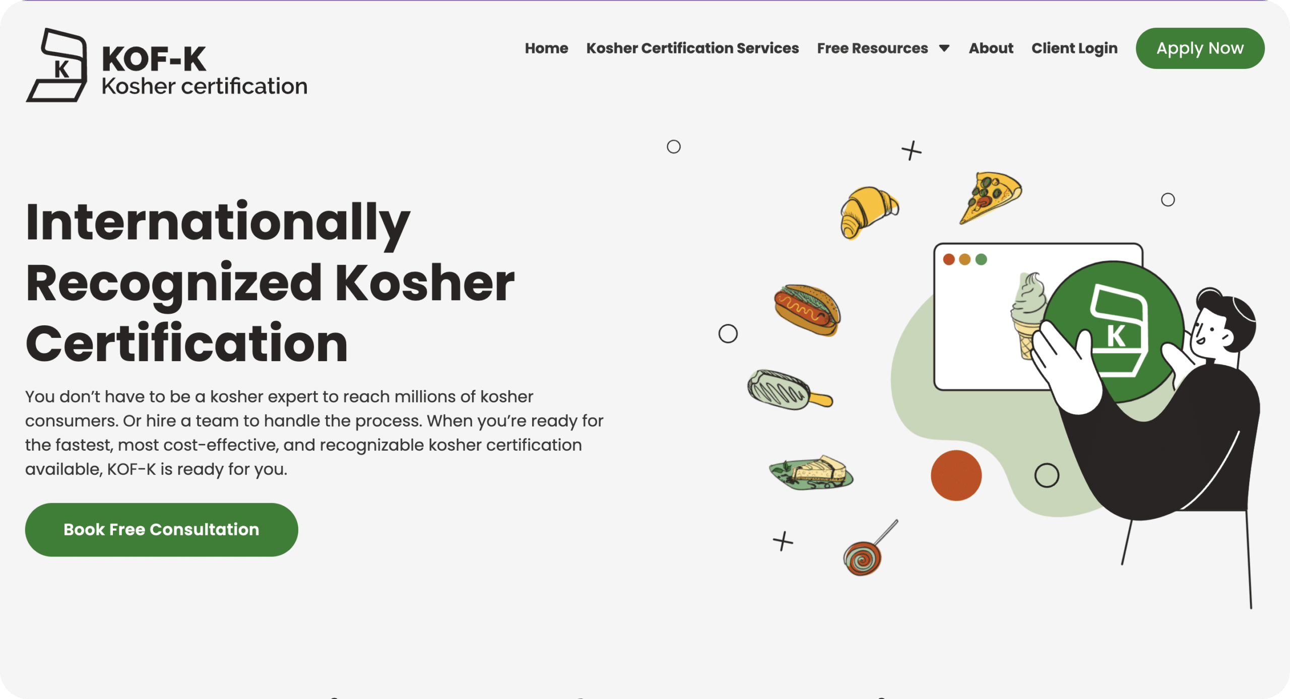
The company had an old, outdated brand and website that didn’t match the current vision of the company and its services and was experiencing low conversion rates because of it. The goal was to design and develop a website to bring KOF-K into the modern age and reflect their tech-savviness, simple processes, and market dominance.
KOF-K wanted to work with a company that had extensive experience in web design and development, one that could take a very “serious” brand and make it “cooler” and more approachable while maintaining its dignified image.
→ → T T h h e e S S o o l l u u t t i i o o n n
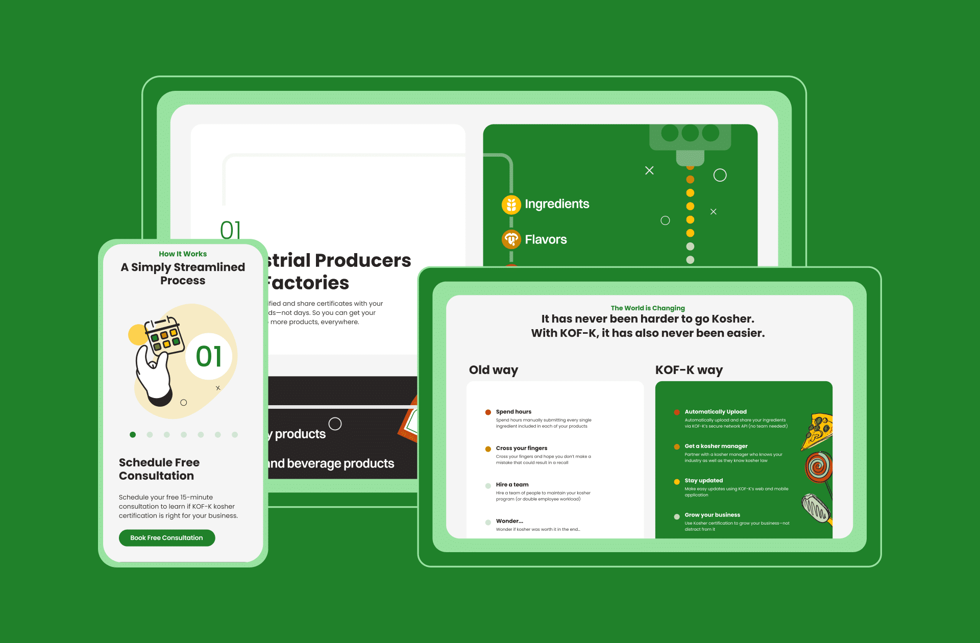
Modern Look, Feel, and Function: We developed a new design language for KOF-K that is much more tech-oriented yet somewhat playful. The result effectively lightened up the brand with lots of illustrations, movement, and light colors.
A Lead Generating Machine: We completely changed their copy to be more lead-generative and approachable, enhancing the new user experience with simple, SEO-friendly, and engaging copy that effortlessly guides users through the online certification process.
Storybook Component Library: As their new design language aims to take place across all of KOF-K’s digital systems, we developed a component library on Storybook that details and demonstrates all new components in an atomic design structure.
From the start, we understood exactly what the KOF-K team lacked in their existing brand and where they aspired to be. Our ability to capture what the client had in mind without them being able to express it reflected a shared vision based on deep brand understanding.


