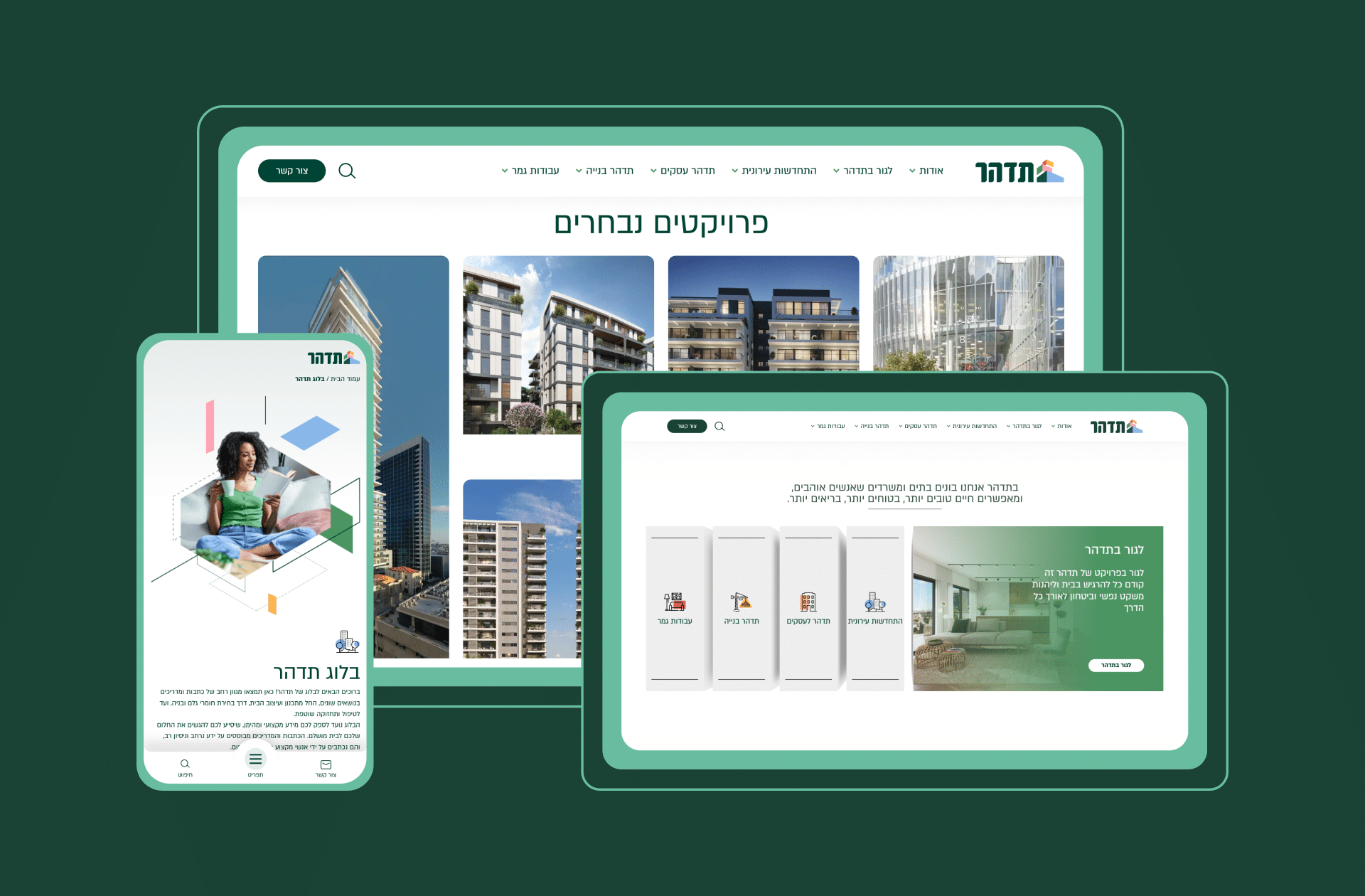
Tidhar's corporate website
How to Take a Leading Company Even Higher
Industry
Construction
Services
Web Design & UI/UX
Web Development
Technology
WordPress GSAP
- Elevated Tidhar’s web presence with a fresh, modern design.
- Simplified UX/UI for diverse customer navigation.
- Advanced back-office system for presentation management.
- Refreshed construction imagery with dynamic animations.
- Bold digital innovation that reflects Tidhar’s industry leadership.
→ The challenge

Tidhar is a leader in Israel’s construction industry and the region’s largest private real estate group. They are quite literally building the country—residential, commercial, industrial—their work is everywhere.
They needed their digital presence to stand out from the competition. Their work is considered among the best in the country, but they needed an online image to match. And it wasn’t just about the look. They also wanted to provide their customers with new cutting-edge tools and experiences to help them dominate their market.
We started the process with comprehensive research to ensure we had the complete picture before we began. During this process, we discovered specific needs relevant solely to them.

→ The Solution
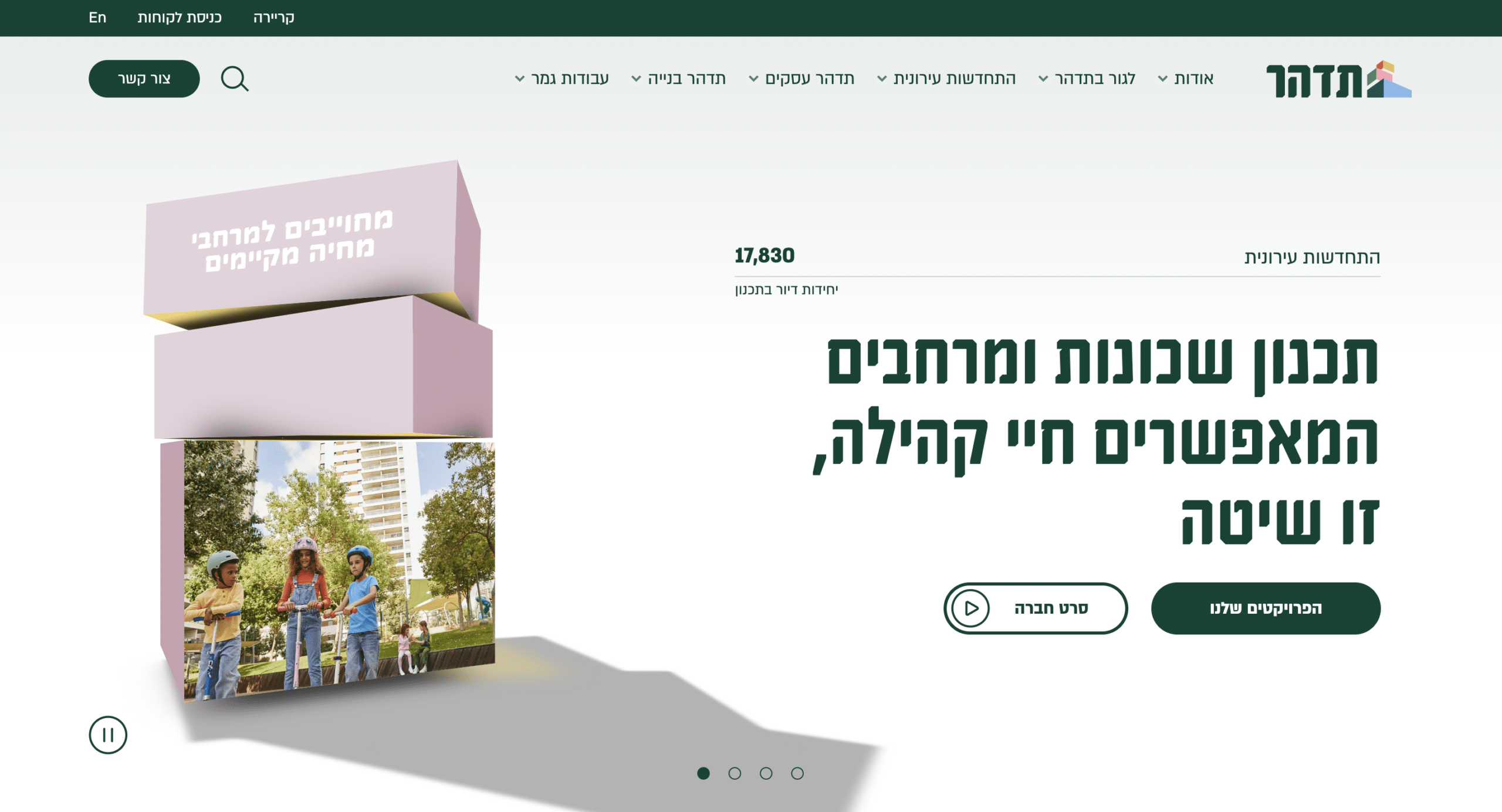
Newly Designed Website Based on the Existing Brand: To make all the heavy building images feel a bit lighter, we added breathable gradients and animated shapes and forms around the main photos of each project to give them a more vivid look and feel. We included icon language to enable goal-directed browsing. The advanced and modular bilingual (Hebrew/English) WordPress website provides maximum flexibility and extended capabilities for Tidhar’s content editors.
Seamless User Experience: The new design included a comprehensive UX/UI. We created a homepage that represents a common denominator for all personas: a show of power, experience, and market dominance. To do this, we used power numbers, a custom 3D map that shows all their projects, a list of current projects, etc. Next, we created a dedicated “homepage” for each of their primary services to house all relevant info for each segment. It’s like having multiple entrances to one building, each tailored to the right person—rather than a one-size-fits-all approach.
Presentation Showroom: We created a presentation area in the website’s back office to manage and categorize all their existing presentations, store templates that are easy to use and modify, automatically fetch the latest information from the website, and provide the ability to inject blocks of content from the website directly into the presentation.
→ Success
We successfully took Tidhar outside of their industry comfort zone. We were bold and introduced edgy new concepts for them, which they needed. They wanted to stand out beautifully, and we got them there. Tidhar loved our enthusiasm, and that’s what made us the standout choice for the job. We gave everything we had to make the project successful, and they appreciated it.
More stories
Back to all case studiesNeed a partner for your next project ?

